
Graphic Design Style: The Ultimate Guide
2020.09.14

Graphic design is an ever expanding creative discipline. A great designer is not just someone who is skilled and versatile on the tools. Great designers are also exceptionally rigorous researchers. We would argue that the ability to research and continually invest time in expanding your knowledge of graphic design styles, both contemporary and historical, is a key ingredient to being an exceptional designer. This is true whether you plan to work in-house or focus on freelance client work. Every designer must cultivate a rich personal library of references to work from, because these become the ingredients of your own design process.
Historically, the generation of new design styles is a cyclical one. If you aren’t aware of where design has been, trends in design can seem to rise and fall on the daily, as though out of thin air. In reality, new stylistic approaches in design develop by taking a little from what came before and a lot from what is happening around it, whether that is in art, film, fashion, politics, music or society in general.
Each design style listed here can be recognisable based on certain elements or design choices. These key components of style can be specific, such as precise typographic choices, a preference for illustrated or photographic images or the strong use of grids. Alternatively they can be more general, like a tendency to a flat depth of field to the design, the colour choices, the prominence of negative space or the quality of the lines used in imagery.
At Shillington, we teach you how to make research a fundamental part of your design process. You will develop diverse and well researched references for each brief you tackle, which in turn allows you to back up and argue for your design choices as they relate to the brief. Read on to learn more about the history of graphic design styles, what their key features are and how you can use them to create an incredible portfolio.
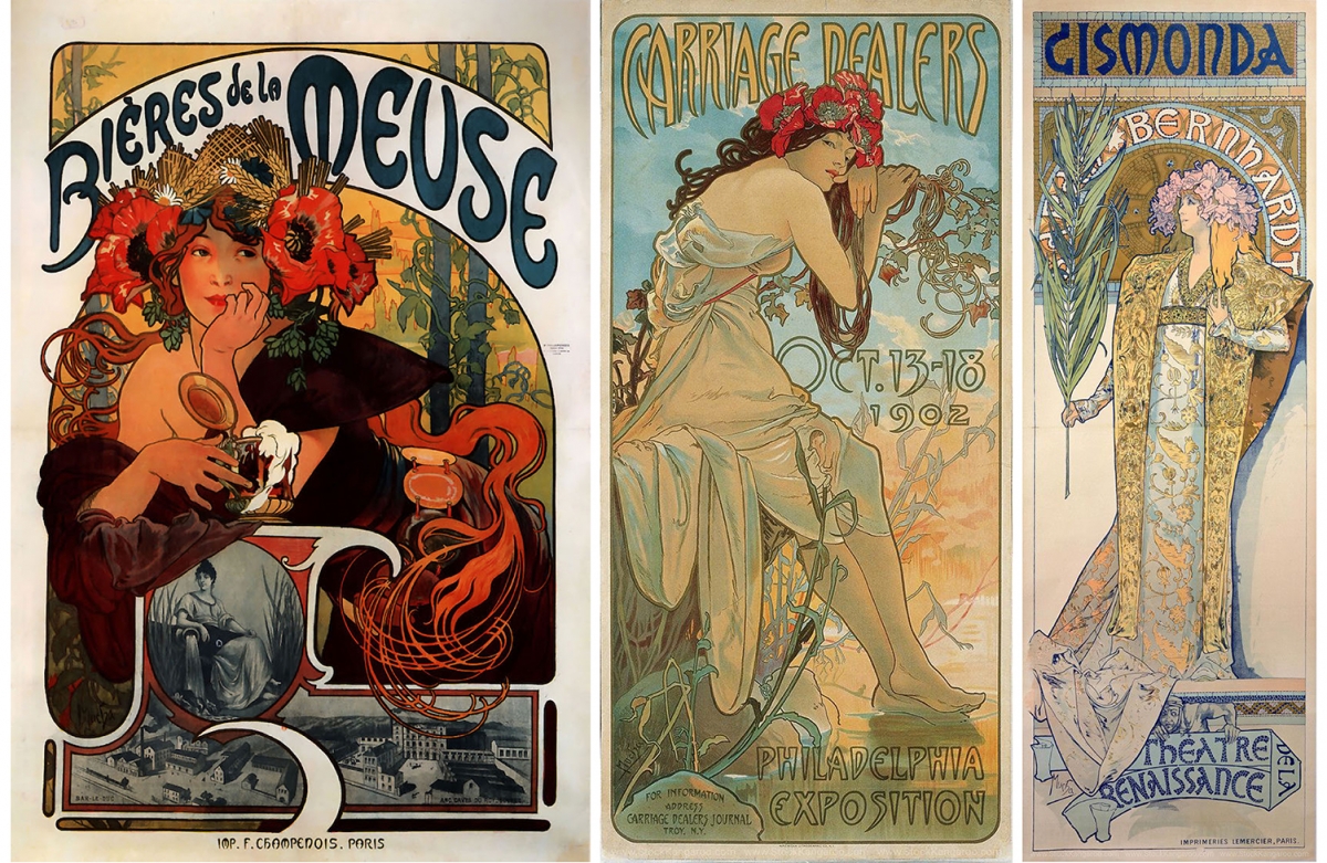
[Art Nouveau]
Art Nouveau is a style of architecture, decorative art and graphic design which rose to prominence in Western Europe and the USA during the late nineteenth century, continuing into the early twentieth century, reaching its peak by the 1920s.
The key characteristic features of this style are the bold outlines and flat yet intricately hand-illustrated designs and typefaces. The characters and forms depicted in this design style possess flowing curves which speak to the unique forms found in nature. The design style is whimsical, romantic and highly technical.
A perfect example of a well-known practitioner of this style is the Czeck-painter, illustrator and graphic artist Alphonse Mucha. His designs graced posters and advertisements of the era, yet his work has also consistently crossed into fine art with paintings and lavish object designs. Characteristic not only of Mucha’s work, Art Nouveau is known for the consistent use of the female form. Most Art Nouveau designs depict sumptuously dressed women, often crowned with flowers, poised amongst beautiful depictions of plants and nature.
Characteristics:
· Intricate illustrative style
· Bold, heavy weighted outlines
· Hand drawn and coloured
· Use of natural forms
· Use of a natural colour and tonal palette
· Regularly features female personas
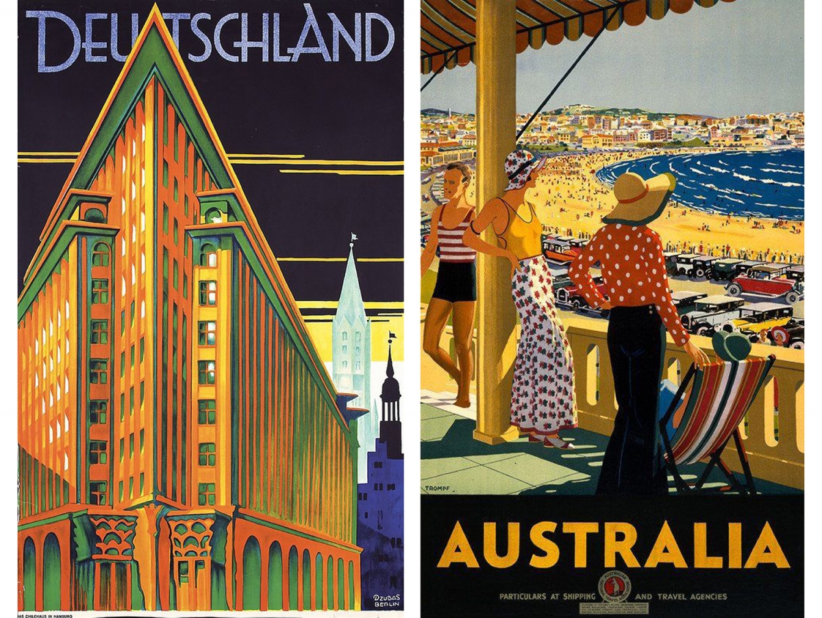
[Art Deco]
Art Deco is a form of design, visual arts and architecture which came to prominence as a symbol of luxury, wealth and sophistication in challenge to the austere influence of World War I. A diminutive of Arts Décoratifs, the name was taken from the 1925 Parisian exhibition titled ‘Exposition Internationale des Arts Decoratifs et Industriels Modernes’ which was the first to feature works of this style.
The characteristics synonymous with this graphic design style are bold curves, strong vertical lines, capitalised type, rich contrasting colours, aerodynamic forms, airbrushing, motion lines and the geometric treatment of patterns and surface.
Of its era, Art Deco became a popular style utilised for advertising. The style was at once progressive and expansive, yet never crossed the line into outrageous. It was enticing, familiar yet exciting. Art Deco style lent itself perfectly to the purpose of promoting luxury brands, fashion labels and far flung travel destinations.
Characteristics:
· Bold geometric shapes
· Use of vertical and motion lines
· Capitalised typefaces
· High contrast in colours
· Flat (in terms of depth)
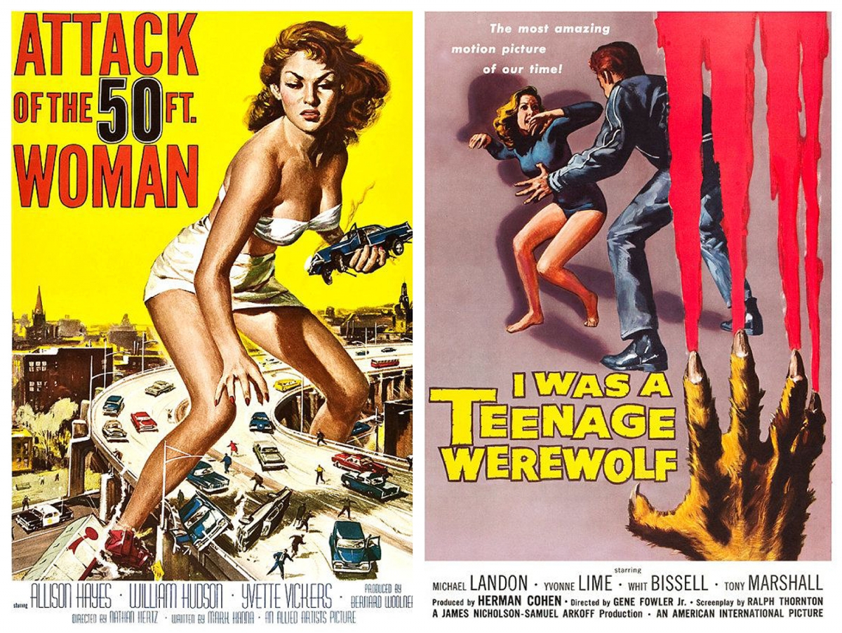
[American Kitsch]
The influence of Art Deco lasted long after the 1930s, inspiring a proliferation of new design styles. One unique style which followed was American Kitsch. This design approach rose to prominence in the 1940s to 1960s in the USA, with an idealised, cartoon-like illustrative style. American kitsch designs of this era were known for their particular font styles and a futuristic stylisation with dramatised or caricatured imagery.
The graphic design style is synonymous with informal shapes, rich and high contrasting colour use, hand drawn and coloured illustrations, space-age forms and dramatic curves. We might observe a cross-pollination between American Kitsch design and the tone of voice in the advertising and signage of the day. Both employed the characteristic idealism of the American dream, peppered with caricatures. Film posters offer some of the best examples of American Kitsch style film, especially those of the science fiction or fantasy genres.
Characteristics:
· Contrasting imagery and fonts
· Cartoon-like illustrative images
· Bold, vibrant colours
· People in dramatic poses
· Aerodynamic shapes
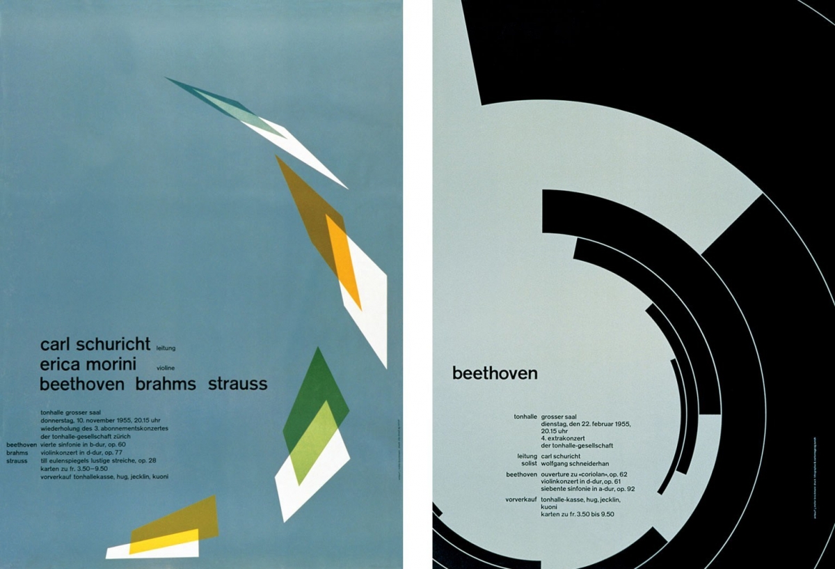
[Swiss/International]
Originating in Switzerland in the 1940s, Swiss style design has concurrently been referred to as the International Typographic Style or the International Style. Hugely influential, this style of design was the foundation upon which the majority of design movements grew throughout the 20th century. Favouring objectivity, simplicity and legibility, this design style was initiated and led by the designers of the Zurich School of Arts and Krafts and the Basel School of Design.
Few other schools of design contributed as much to last century’s stylistic innovations. In particular the use of grids and asymmetrical layouts, alongside sans-serif typography were amongst the most prominent stylistic developments. The combination of typography and a general preference for photographic images are also noted as key characteristics, though colourful, geometric block illustrations were also common.
As with Art Deco, poster design in particular became one of the most influential forms of the Swiss/ International design style.
Josef Müller-Brockmann is amongst the most celebrated graphic designers of the 20th Century. As a figurehead of the Swiss style, his designs offer a veritable cornucopia of references. Müller-Brockmann studied at the Zurich School of Arts, previously noted here as one of the key institutions from which this design style sprung. His work is praised for its simplified, gridded design approach and a preference for unornamented typefaces, such as the sans-serif Akzidenz-Grotesk typeface.
Characteristics:
· Consistent use of negative space
· Saturated, matte colour palettes
· Very ‘clean’ and simple
· Sans serif fonts favoured
· Asymmetrical layouts
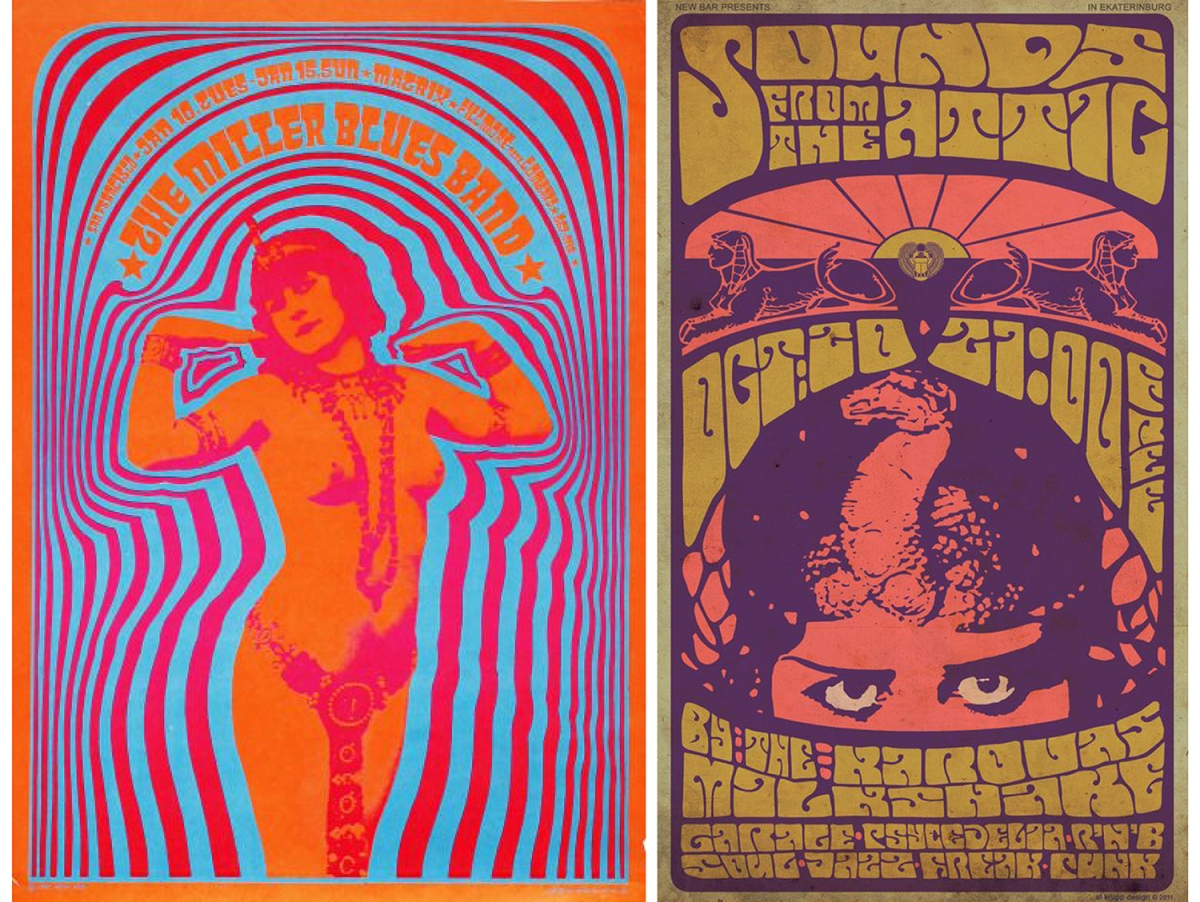
[Psychedelic]
The phenomena of psychedelic design, art and music is synonymous with the 1960s and 1970s. It influenced and was influenced by the style of dress, philosophy, literature and culture of the time, while holding sway over the design culture throughout the decade. It still emerges as a recycled stylisation in design today.
Band and concert posters of the 1960s to 1970s offer a vast reference library for this style. We see the use of bright and clashing colours, illegible hand-drawn curvaceous type, abstracted curvilinear shapes and metaphysical or surreal illustrative or photographic subject matter. The psychedelic design style harbours the influence of Art Nouveau designs, particularly in the hand-drawn type and consistent use of images depicting women or the female form.
Characteristics:
· Influenced by the psychedelic drug culture
· Intense, clashing colours
· Type and image use influenced by Art Nouveau
· Hand-drawn type generally illegible and hard to read
· Abstracted curvaceous forms and design elements
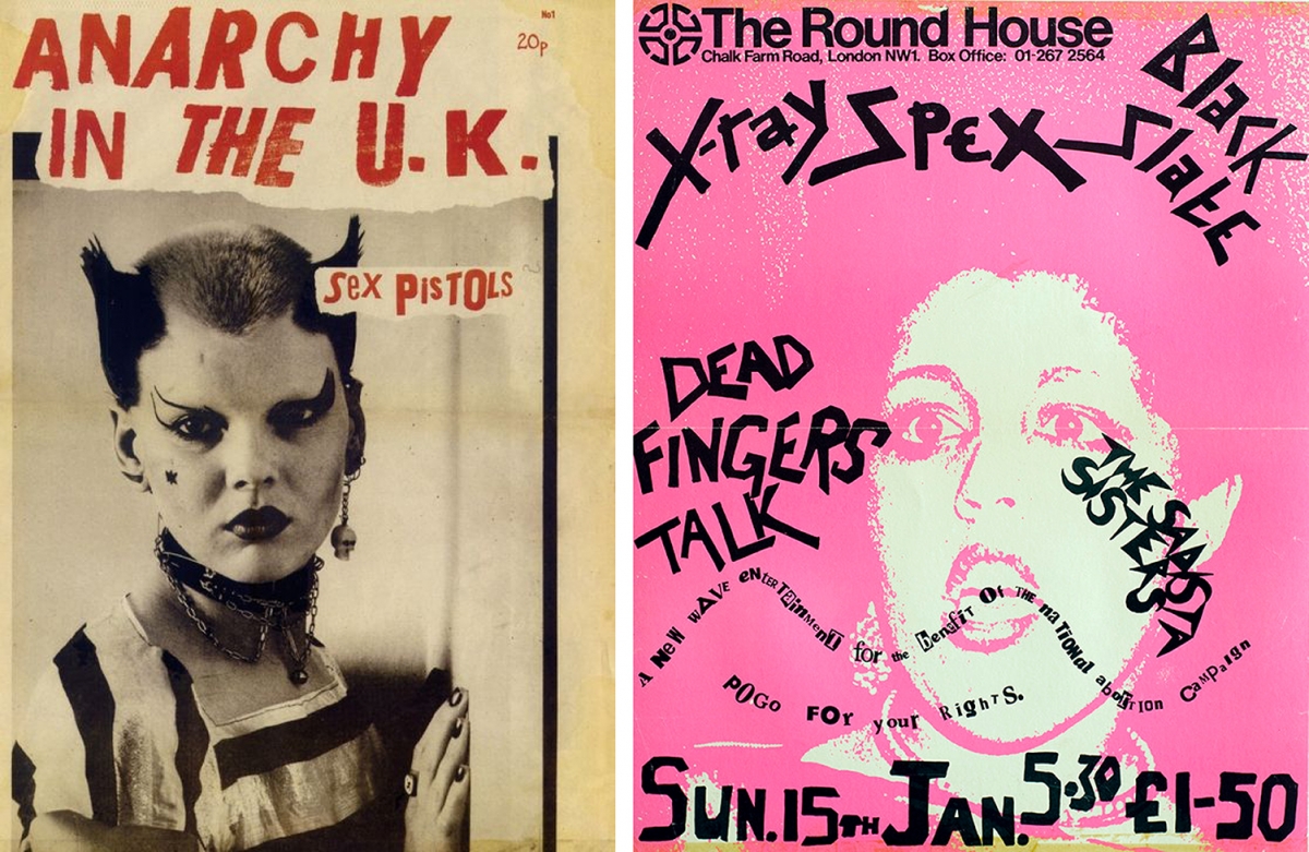
[Punk]
A strong ethos of DIY and anti-establishment attitude permeates all aspects of punk design. The rawness of this form of design came from the culture in which it originated in the late 1970s punk music movement. The design of the time spoke to the individual designers and artists creating these works. Most were entirely untrained as designers and usually were the band members or friends of the bands whose posters they made.
Iconic elements of the punk design style are the DIY hand written or cut and paste typographic elements. Often designers collaged text using found and incongruous type elements—haphazardly intermingling bold serif and sans serif typefaces to achieve the classic punk style.
Punk design style lives on in contemporary zine culture, album cover designs and DIY poster design. These creative communities often operate from the position of having low to no budget. The cheap and readily available production mediums of screen printing and photocopying offer punk design a consistent aesthetic which is very easily emulated.
Characteristics:
· Low quality, photocopier printed images
· Grainy and matt screen printing effects
· Found and collaged type
· Predominantly photographic imagery
· High contrast, bold colours
· Overall rough, textured aesthetic
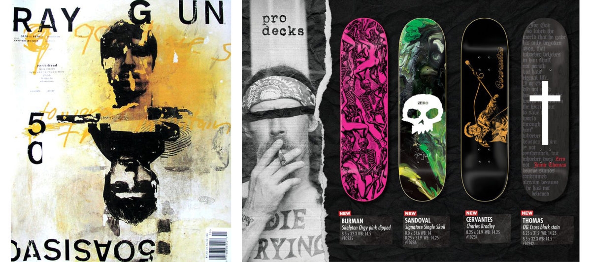
[Grunge]
Emerging as a design style in the wake of the millennium, grunge takes its name and inherent style from the 90s music and subculture movement, synonymous with Nirvana and the Seattle sound. Distressed and layered textures, ripped and uneven edges alongside a rather chaotic approach to layouts are all key features of grunge design. While there are certainly some nods to what punk design created, grunge is very much a unique design style.
Embracing the grit and urban grime that was endemic to the 90s grunge scene, this style embraces the use of many critically avoided approaches in design. Uneven lines, crooked elements, dirty stains, badly hand-written text and very grainy or torn photographs all play their part in conveying the tone of grunge style.
Some popular and recognisable contemporary uses of grunge design style can be seen in the branding of skateboarding companies and magazines, band websites and gig posters, alternative fashion brands, music venues and street art culture.
Characteristics:
· Dirty textures and background images
· Irregular lines and crooked elements
· Dirty stains such as coffee rings and spilled out liquids
· Torn images and paper edges
· Hand-written and hand-drawn elements
[Minimalist and Flat]
Minimalist and flat designs are a current graphic design style, which first started to gain popularity in the 2010s. This style is easily recognised for its monochromatic or limited approach to colour use, minimal shading, bold line work, strict adherence to grids, crisp photographic images, simplified linear illustrations and a preference for sans serif typefaces.
The ongoing popularity of minimalist and flat design is palpable. It is utilised in every sphere design is found, from branding and packaging, to editorial, infographics and digital. This style is everywhere because when done well it offers clean, stylish and easy to read design outcomes which are easily translated across every design format.
Iconic examples of the minimalist design style can be seen in the branding of well-known skincare company Aesop, whose brown glass bottles and minimally designed packaging are recognised as a style icon globally. An example from print and editorial would be art and travel magazine Cereal, with its sleekly designed covers and efficient, minimalist layouts. In all, despite seeming sparse, this approach to design offers our digital age a versatile approach for the effective communication of information, branded style and story telling.
Characteristics:
· No depth of field
· Minimalist design space
· Neutral tones and secondary colours
· Linear design elements
· Use of negative space
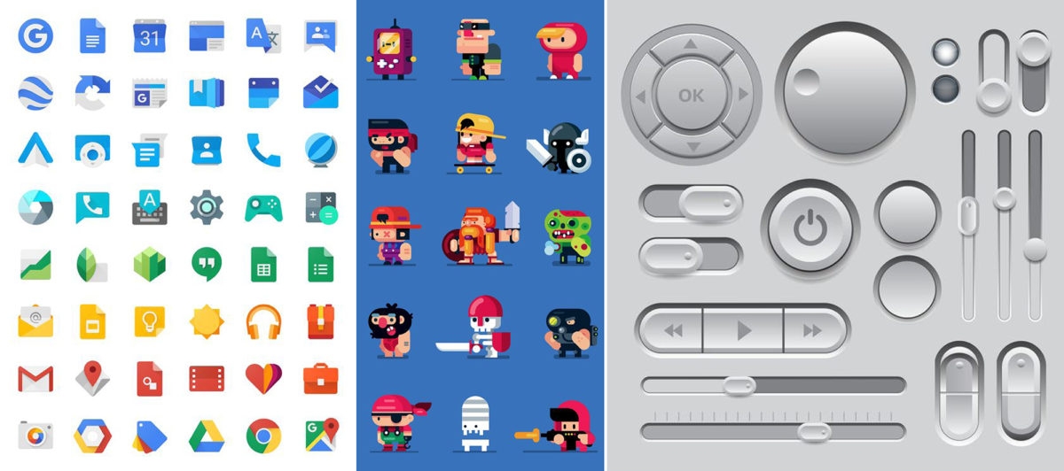
[3-Dimensional]
As technology advances and becomes more widely available, innovations in design continue. While not entirely recent in its use, the quality and realism of 3-dimensional design has skyrocketed with the advent of more powerful and refined programs.
This style is highly popular across a range of designed spaces, though particularly amongst gaming, online and digital brands. While characters, logos and online content are all designed with a 3-dimensional view in mind, so too are the simple appearance of skeuomorphic elements such as buttons, icons and other interactive features. These seemingly simple design elements are often highly considered and are in turn given a more weighted and lifelike appearance with a few simple 3-dimensional additions.
A perfect example would be to turn on your phone and look at the Google suite icons. With just a few indications of depth and light, many of these icon illustrations are given a 3-dimensionality. Most app icons maintain skeuomorphic elements, meaning the imagery has been designed to mimic the weighting and lighting of the original 3-dimensional object they replicate.
Another key use of this style of graphic design which many new designers are excited to use is the ability to swiftly mock up designs digitally and offer a sense of weight and presence to the designed object. The simple inclusion of a drop shadow and some design tweaks can move a completely fanciful product design from a flat, lifeless digital image to a more believable, lifelike object.
Characteristics:
· Illusion of live-like depth and volume
· Employs various lighting effects
· Shadow and depth indications often utilise one colour, with tonal variations
While this is by no means an exhaustive list, there is no doubt you will now begin to recognise these and other distinctive graphic design styles all over the place. Developing and cultivating your knowledge of design styles through continuous research will allow you to become a more adaptive and effective designer no matter what project you take on.
/
Source: https://www.shillingtoneducation.com/blog/graphic-design-styles/
Author: #ShilloNY teacher Shrenik Ganatra.
Pic: #ShilloNY teacher Shrenik Ganatra.