
Why We Should Integrate Tactile Surfaces into Architecture
2020.12.05

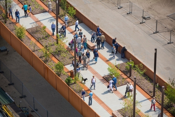
Accessibility is one of the most important considerations in architecture, ensuring that the built environment caters to people of all abilities. However, popular conceptions of what disability and accessibility look like remain limited, and often encompass only physically disabled people such as wheelchair users. Among architectural designers especially, it is common to visualize accessibility as adding ramps, wide corridors, and elevators. However, disability can take many different forms, some less visible than others; accordingly, accessibility in architecture means much more than accommodating just wheelchair users. For the visually impaired, incorporating specific tactile elements in architecture and urban design can vastly improve the navigability of a foreign space. In this article, we talk about tactile paving specifically, including its different forms, its history, and its means of implementation.
In 1965, Japanese engineer and inventor Seiichi Miyake first developed tactile bricks to help a friend who was beginning to experience visual impairment. Two years after it was invented, Okayama City in western Japan became the first city to install tactile paving around the city. Ten years later, it was widely adopted by the Japan National Railway, and by 1985, it became a requirement in cities around the country. Soon, it spread beyond the borders of Japan; today, tactile bricks are ubiquitous not just in Asian countries, but in Australia, the UK, the US, and many other countries around the world.
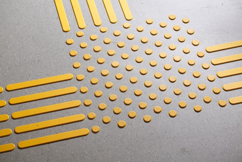
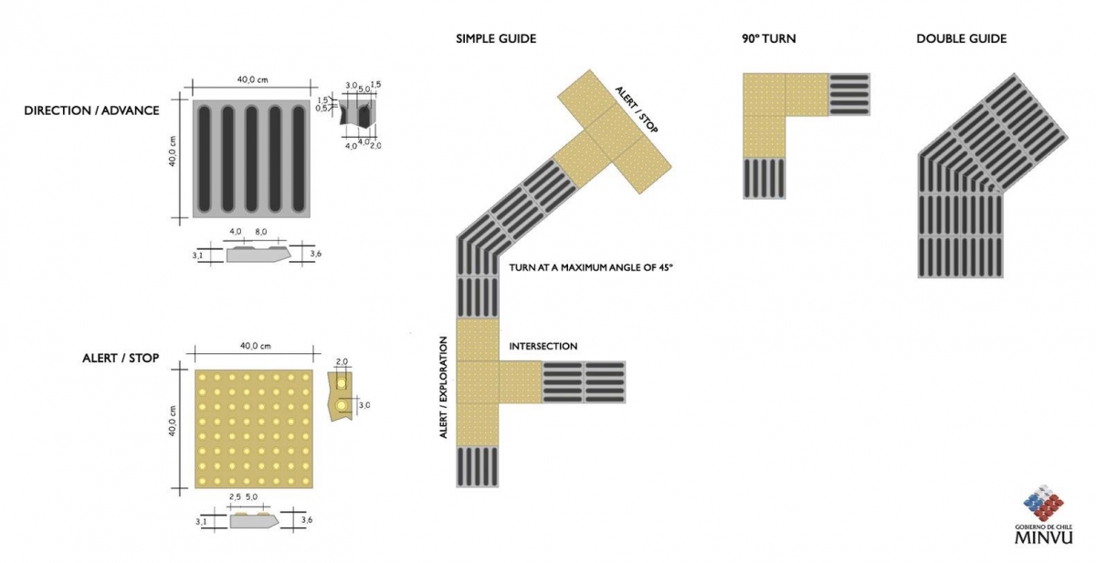
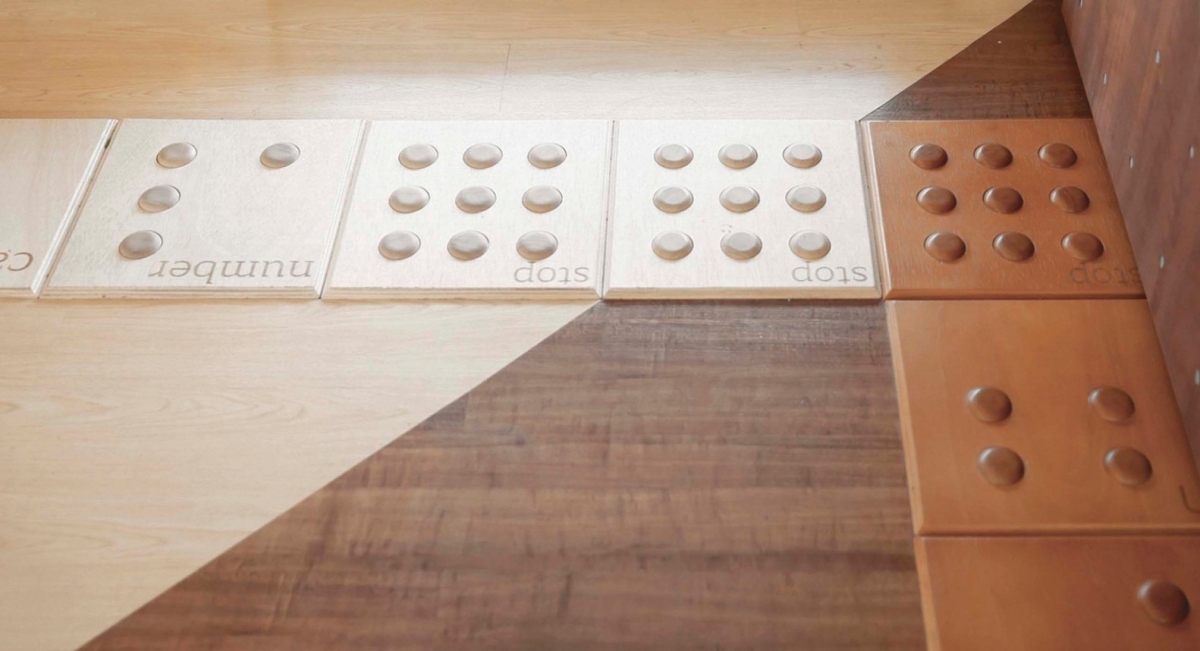
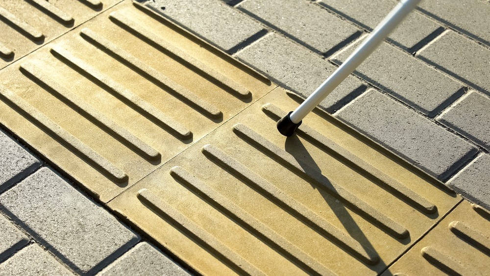
There are a wide variety of different types of tactile paving, with different colors and markings indicating different meanings. Typically, tactile bricks are painted bright colors to make them more visible to partially-sighted pedestrians: the Americans with Disabilities Act, for example, requires that the color contrast of the tactile bricks and its surrounding pavement be at least 70%. Many countries use a bright yellow color for this purpose. The extrusions of the paving also follow a specific code. In the UK, tiles with ‘blister lines’ or parallel lines of truncated domes indicate a transition from the sidewalk to the road. Similarly, ‘offset blister lines’—where the domes are staggered—warn vision-impaired people of the edge of a railway platform.
Another important tactile paving typology is the corduroy hazard warning tile, which consists of parallel extruded lines rather than dots. In the UK, these tiles warn of specific hazards such as steps, ramps, or platforms. Other tiles, especially the directional or guidance tile, guide users’ movement rather than warning them of hazards. These tiles arrange parallel extruded lines in the direction that people should walk, helping them dodge obstacles such as street furniture or plants. Depending on the country and the guidelines, there is usually a minimum height for the tile extrusions as well.
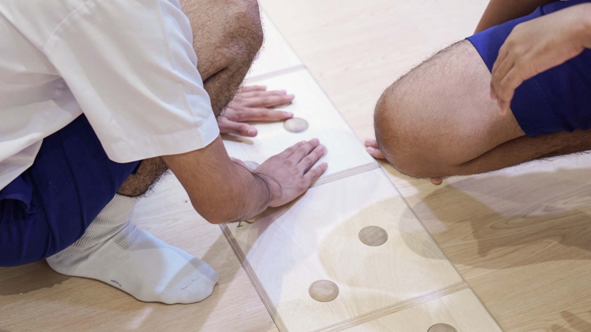
These tiles can be made of a few different materials and are concomitantly applied in a few different ways. A common material for tactile paving is rubber, which can be quickly installed and tightly sealed to the existing pavement. Other tiles may be made of stainless steel and glued with epoxy glue to the concrete.
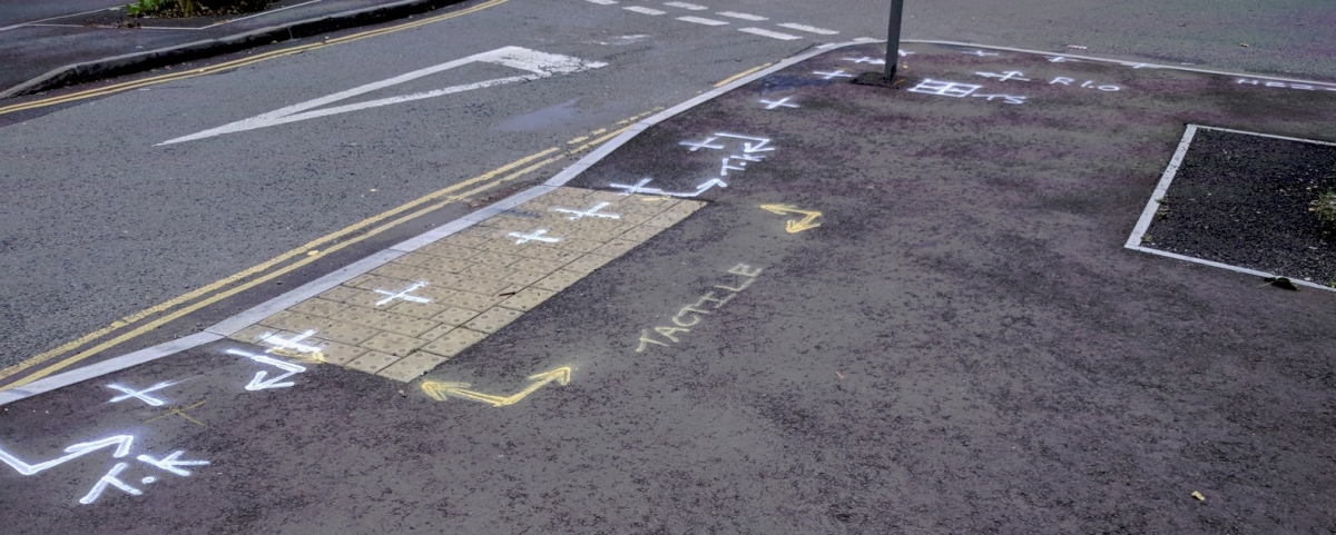
These tactile surfaces are absolutely essential to architecture and urban design, permitting the visually impaired to more easily navigate hazards in the built environment since the disability is not in the person, but in the barriers of the physical space. To incorporate them most effectively, architects should actively consult the accessibility guidelines of their own country or district. By following these basic guides, it is even possible to make these functional products become an added value for architectural design, creating inclusive projects that, from their details, improve the lives of all their occupants.
---
***Source: https://www.archdaily.com/952355/why-we-should-integrate-tactile-surfaces-into-architecture
***Author: Lilly Cao