
6 standout web design trends set to make waves in 2022
2022.01.24
Discover the web design trends that will shape 2022.
Staying on top of the latest web design trends is a sure-fire way for web designers to ensure they're prepared to capture the fleeting attention of the online masses among the huge competition. We’ve all had a lot of time to browse the web over the past two years, and it's safe to say that this time presented – and continues to present – exciting opportunities and potential for more creativity in the evolution of web design.
We’ve witnessed the embracing of nostalgia, no doubt to help soothe and comfort us during these tumultuous times. But at the same time, we’ve seen designers rethink design norms and principles, and push others to follow suit. In tandem, these two developments represent the future of web design in 2022 and beyond.
Whether it’s the rise of one-page websites, an increased focus on typography, or the embracing of more neutral and abstract design elements, creating a captivating website comes down to the details. The six web design trends listed below can help designers fashion a website that pays homage to the wild frontier of the web’s early days while keeping an eye squarely toward the future.
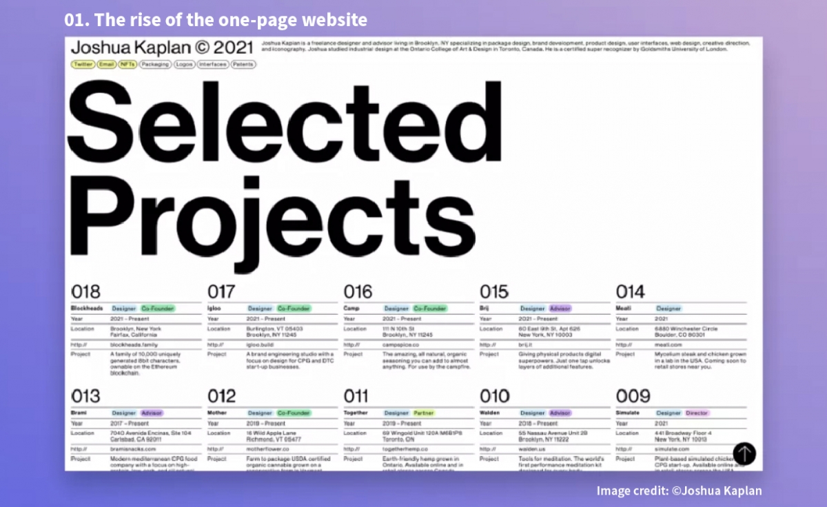
01. The rise of the one-page website
It’s an old adage but it still rings true: less is more. If there’s one thing we always crave, it’s simplicity. This can be true of websites, where the most effective are often the least complex. Look no further than the increasing number and popularity of one-page websites that forgo menus and internal link navigation in favour of simple scroll navigation.
In many instances, websites merely point visitors to another source. One-page websites force designers to rethink their plan and structure as a whole to not only put all their content front and centre, but more importantly to determine what's most vital to highlight in the first place. These sites tend to work best when the subject matter is narrower, such as a portfolio, but can serve as a nice bridge to get people where they’re supposed to be going quicker and more efficiently without needless searching or distraction.
Ultimately, the one-page website mentality allows designers to produce more creative work. Take a look at Joshua Kaplan’s portfolio site. He uses a consistent content structure so that viewers don’t get lost while reducing distracting elements like big images and backgrounds to keep the focus on what matters.
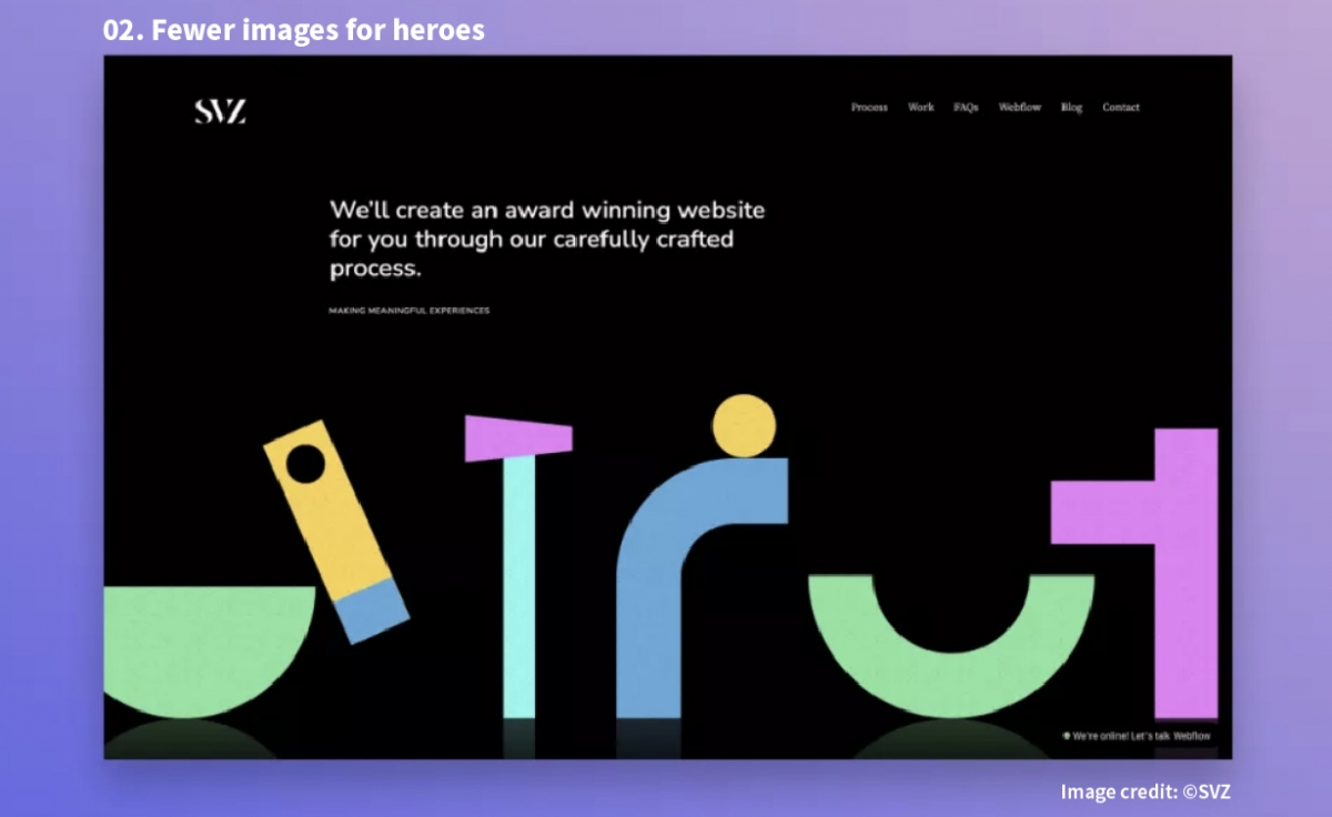
02. Fewer images for heroes
The hero section of a website doesn’t need to solely rely on apparent imagery or photo carousels to be super. Keeping things simple quite often helps set the tone for why the visitor is there in the first place, and why they should continue to scroll. Just look at websites like SVZ, which use colour, shapes, typography, and layout to communicate their unique brand identity in a simple, yet enticing way.
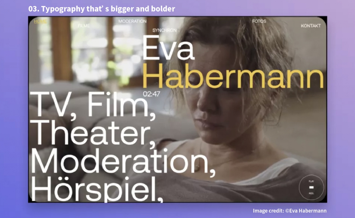
03. Typography that’s bigger and bolder
A good exercise for any web designer is to play around with typography from the git-go. No images, no graphics, just type. Sometimes, the bigger and bolder the typography, the better and longer-lasting impression a website can make. But that’s not always the case. At a certain size, words become more of a graphic element than simply copy, making typography the visual focal point of a site. Choosing a font helps set the tone for what the audience expects from the website, so it’s important to strike the right balance between size and scale.
Eva Habermann’s film portfolio website overlays large typography onto a moving film portfolio reel. The text is actually blocking part of the image, eliciting curiosity in visitors to see more. The use of a sans-serif font in two colours creates just the right amount of contrast without making the text overwhelming or illegible.
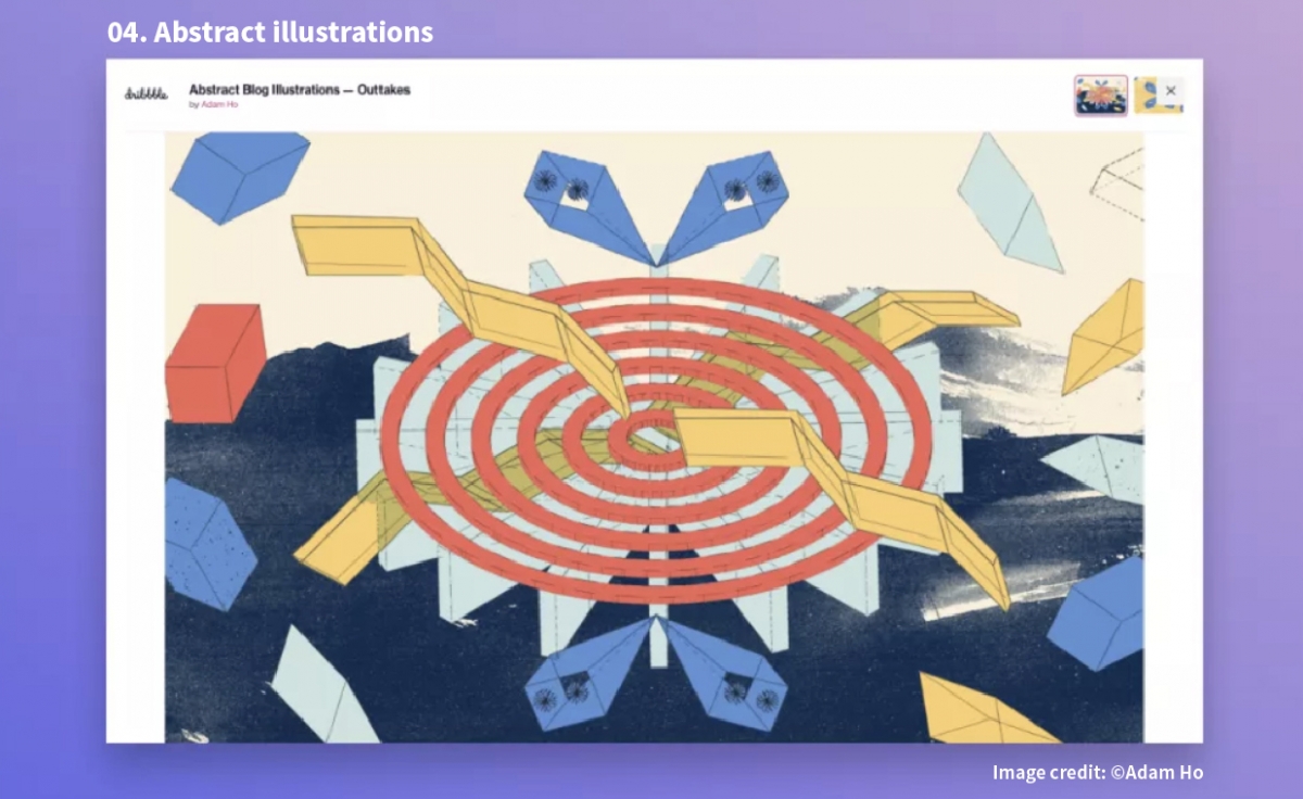
04. Abstract illustrations
Illustrations have obviously been used in web design for years, yet abstract illustrations, in particular, are continuing to rise in popularity. Why? Well, they offer designers the unique opportunity to mix and match different mediums for some interestingly unpredictable results.
Organic textures add a handmade look and feel, hand-drawn scribbles provide familiarity, mixing and matching seemingly endless possibilities – a welcome contrast in the digital landscape. Take a look at these blog illustrations by Adam Ho. Utilizing ultra-thin lines and quirky graphic shapes, Adam’s illustrations feel like they could be technical drawings without directly depicting any specific object.
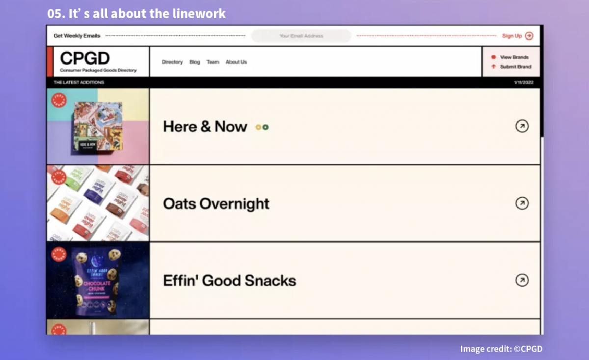
05. It’s all about the linework
Toggling that nostalgia/modernist line is, wait for it, linework. Designers are using lines to delineate sections, paragraphs, headers, and product galleries on websites with more visual weight and flair. Linework is also great for creating dynamic grids for an entire webpage. In some cases, these structured lines and grids make static websites feel almost app-like.
From a different perspective, this sort of design grants websites a more physical feel as well, almost akin to a magazine or newspaper. CPGD uses bold black lines to evoke an almost retro graphic effect. Each section within the lined grid is a different colour helping differentiate content, and the mouseover colour change orients visitors on the page. The illustrations help bring this style even further into trending territory.
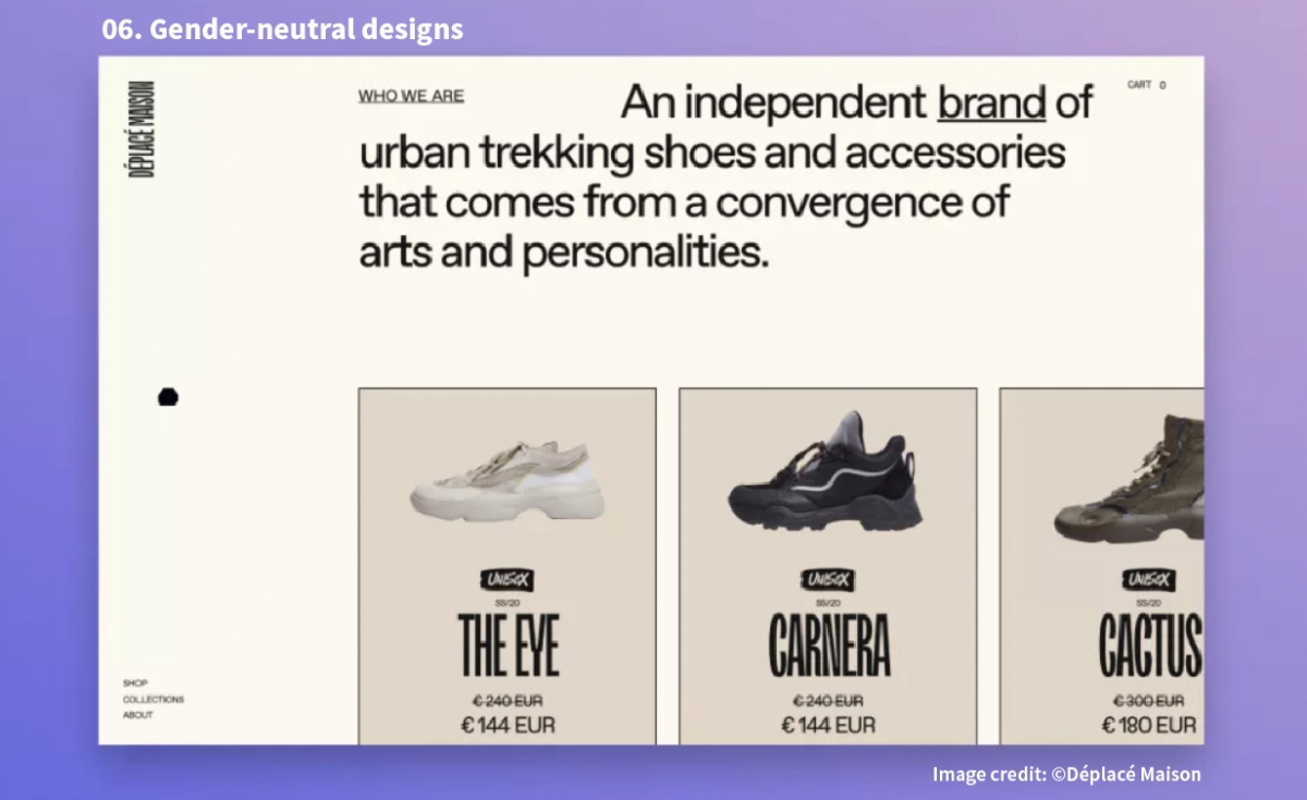
06. Gender-neutral designs
Previously considered just being thoughtful, gender-neutral design is now becoming a standard. Creating a baseline of accessibility for all visitors is the first step in looking beyond societal assumptions. For instance, pinks aren’t just for women and “hypermasculine” elements like flames and skulls don’t need to be front and centre to lure in a male audience. Simply put, designers should avoid making any assumptions about the audience.
It’s now increasingly common to offer multiple gender options and pronouns in both website forms and drop-down menus. Even in ecommerce, many sites are becoming more inclusive by not sorting clothes by gender (see Déplacé Maison as an example) and including modeled shots on various body types to make their products more accessible.
-
▪ Source: https://www.creativebloq.com/features/web-design-trends-for-2022
▪ Author: Max Lind
▪ Image Credit: ©Webflow / ©Joshua Kaplan / ©SVZ / ©Eva Habermann / ©Adam Ho / ©CPGD / ©Déplacé Maison