A typeface that captures the dyslexic reading experience
2022.03.02

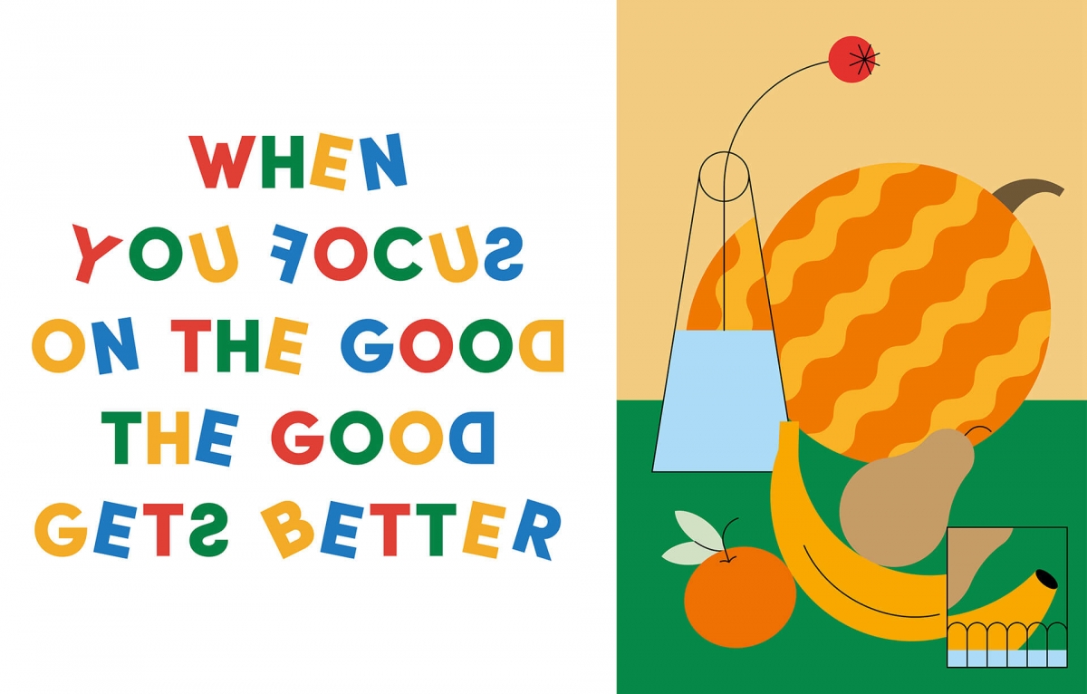
The new typeface called Dyslexic Font, created by Switzerland-based illustrator Rocio Egio and Indian designer Pranav Bhardwaj, is playful and special.
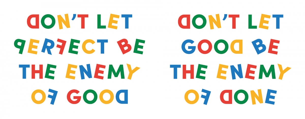
Typography is an art form that enhances the readability and visual appeal of fonts and typeface. Typeface design often works in congruence with typography to enhance the legibility of the printed text. But what if they did something different? What if a typeface communicated a cerebral experience as a visual rather than as a text? Last year, on the occasion of International Dyslexia Day on October 8, Switzerland-based illustrator Rocio Egio posted a graphic on her Instagram account that captured her interpretation of the alphabet. The caption read: "According to the definition, dyslexia is a disorder that involves difficulty in learning to read or interpret words, letters, and other symbols, but that do not affect general intelligence. According to me, dyslexia is a graphic superpower.”
What began as a celebration of one's atypical approach to the written word, turned into a unique font. While Egio was creating her unique illustration in Switzerland, India-based Pranav Bhardwaj, a designer based in New Delhi, was inspired by her post and reached out to her with an idea to bring the illustration to life as an actual font. And so the Dyslexia Font was born. In a comment to STIR, Egio cited her personal experience as an inspiration saying, "Since I was little, I have changed letters, confused their form or used them wrong." The Dyslexia Font for the most part is readable but with a little difficulty, and is meant to emulate Egio's own experience with the alphabet.
Dyslexia is categorised as a learning disability or disorder. It is important to note that dyslexia is not an intellectual shortcoming, but rather an alternate method in which one processes information. Early childhood development encourages the use of alternative teaching methods that involve tactile tools and repetition. Many consider dyslexia to simply be a different way of learning, and that regimented and standardised teaching methods highlight the learning disability further.
Egio and Bhardwaj's font, which can be downloaded from the illustrator's website, tries to transfer the dyslexic reading experience to a larger audience. Egio clarified, "I just want to make clear that the Dyslexia Font is a representation of my way of seeing letters, words and messages. Each dyslexic brain has its own singularities when it comes to the interpretation of the alphabet. This is not a font more readable for my dyslexic friends. This is just an example that comes from my own experience.”
In addition to the font Egio creates visual design graphics that feature geometric compositions and vibrant colours as her tools, to celebrate the complexity of the commonplace through simplicity. It is the subtle details that set her illustrations apart and attest to the love of her subjects. Centred on the idea of spreading a positive message, and working with a manifesto to do it with love. Egio shares through her work an optimism and authenticity that is hard to resist.
When asked why she refers to dyslexia as a superpower, Egio explained her journey saying, "I didn't know I had dyslexia until I turned 24-years-old, as soon as I found it out, everything made sense. My head understands the world in visuals, that is why I have been drawing since I was a kid. For me, translating words or ideas into graphic language is necessary to process and understand the world. To me, everything seems less complex with colour, shapes and composition. If I don't draw it, I am thinking about it in a visual language. We can say that dyslexia is an advantage in my day to day and what I do. That is why I call it my superpower.”
Egio is making a powerful statement by calling dyslexia her superpower and crediting it for her ability to create geometric and colourful compositions. The supposed limits of the learning disability disappear when viewed through this lens. The playful script appears to dance across the screen as if they know their purpose but they do not know where they belong in each word. This would be an opportune moment to reminisce on my childhood when I made a similar statement to my parents about the dancing letter. This script is the first time I could show them what the experience of reading is and why the words bread and beard will always be hard to tell apart.
-
▪ Source: stirworld | https://www.stirworld.com/see-features-a-typeface-that-captures-the-dyslexic-reading-experience
▪ Author: Devanshi Shah
▪ Image Credit: ©Rocio Egio